.svg)


Aerial photographs of the newly connected Malé-Vilimalé section have sparked questions across social media. Some say the bridge appears to rise, dip and bend. Others say it is simply a matter of perspective. R24 looks at what can actually be established from the available evidence.
 Features Desk
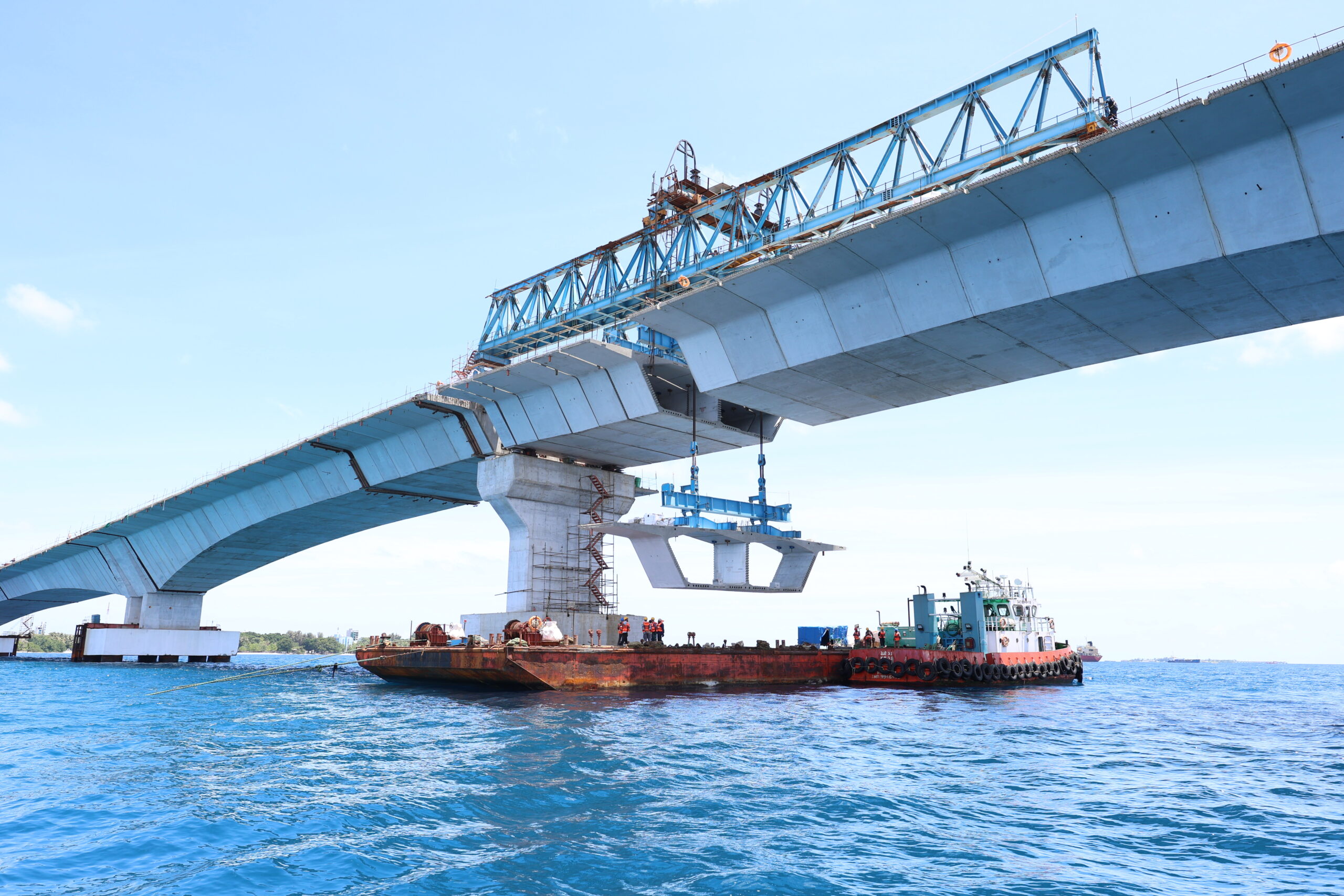
Photo: R24
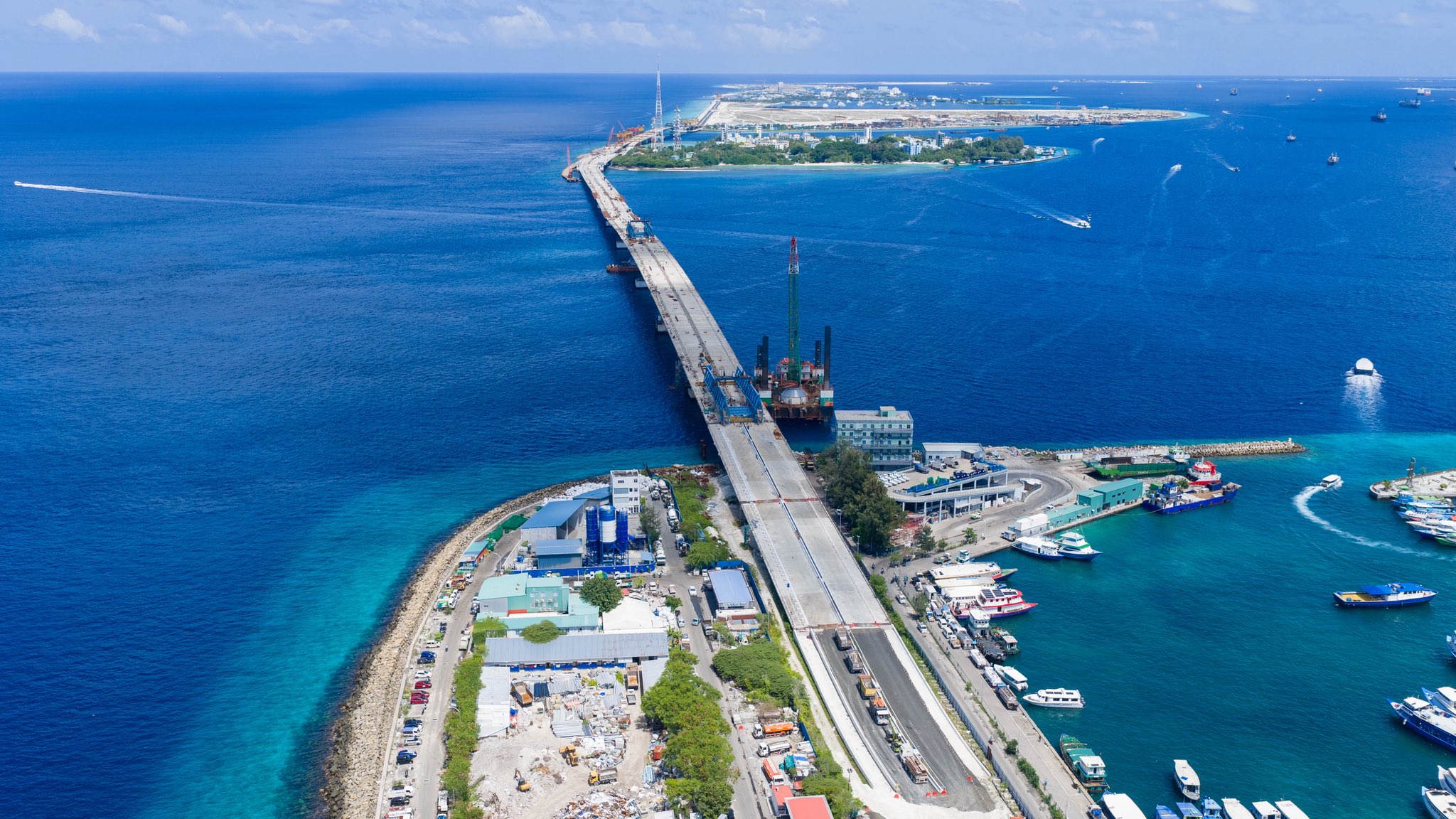
Aerial photographs of the newly connected Malé and Vilimalé section of the Thilamalé Bridge have triggered a new wave of discussion online. In some images, the bridge appears to rise and dip along its length. From other angles, parts of the structure seem to move from side to side, giving the impression that the bridge is not straight.
For some people, the photographs have raised a serious question: is there something wrong with the bridge?Others have argued that what people are seeing is simply the result of perspective.
So what can actually be established? The answer is more complicated than either side of the social media debate suggests.
The discussion comes just as the project has reached an important stage.
The final segment connecting Malé and Vilimalé was installed on Yesterday, completing the main bridge structure between the two islands. The section still requires finishing works, including safety infrastructure, lighting and other road-related works before it can open to traffic.
The Thilamalé project is much larger than a single bridge. The Greater Malé Connectivity Project is a network of bridges, viaducts, causeways and roads intended to connect Malé with Vilimalé, Gulhifalhu and Thilafushi. The overall connection is approximately 6.7 kilometres long. That is important when looking at photographs of the structure. It is not simply a long, straight road suspended over the sea.
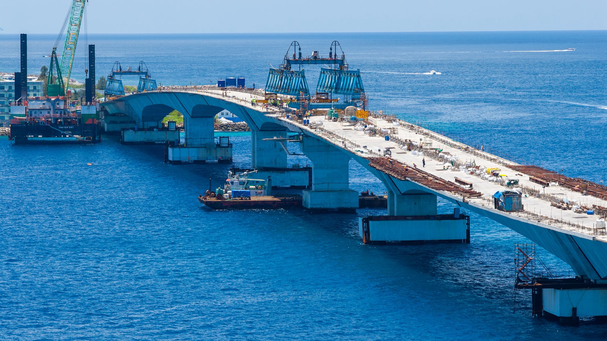
There are several things that can affect how a bridge appears in an aerial photograph. One is the alignment of the bridge itself.
Engineers design bridges in both horizontal and vertical dimensions. a bridge may change direction horizontally or rise and fall vertically depending on the route, navigation requirements, road connections, span arrangements and other engineering considerations.
That does not automatically mean there is a construction problem. The other factor is the photograph. A long structure viewed from above and at an angle can look very different from how it appears when viewed from the deck itself. The camera position, lens, distance and angle can exaggerate changes in alignment and elevation. That appears to be part of what has happened with some of the images circulating online. But saying that does not mean every unusual-looking photograph should simply be dismissed.
A photograph can raise a legitimate question. It just cannot answer an engineering question on its own.
The construction method is another part of the story that is often missing from the social media discussion. the Thilamalé Bridge uses large precast concrete segments that are manufactured separately and then installed at sea.
In April 2025, a navigation-span segment described by the Indian High Commission as the world’s tallest precast navigation-span segment was installed on the project. the segment was reported to measure 8.23 metres in height and 25.37 metres in width, with a weight of about 216 tonnes. It was produced using the long-line method.
The project also uses segmental bridge construction, with sections progressively connected as the bridge advances. That means the final geometry is not something that is decided simply by looking at how individual pieces appear from a distance.
The position of the piers, the geometry of the segments, the connections between them and the final deck profile are all part of the engineering design.
The question of the apparent bends is not new. Infrastructure Minister Dr Abdulla Muththalib previously responded to similar concerns after photographs of the bridge circulated on social media.
During a site visit, the minister said the bridge had been designed through detailed engineering processes and argued that the apparent bends and depressions seen from a distance were an optical effect rather than a construction defect. He also pointed to the way the structural segments are connected.
There is a reasonable engineering point behind that explanation. however, one part of the public discussion needs to be separated from another.
The fact that the bridge segments connect correctly does not, by itself, provide a complete assessment of the bridge’s geometry. Engineers also have to verify the actual position and elevation of the completed structure against the approved design and the permitted construction tolerances.
That is why measurements matter more than photographs.
Based on the available information and from the contractors , there is no evidence establishing that the apparent waves seen in photographs are a structural defect. at the same time, it would be too strong to claim that photographs showing the apparent waviness have been scientifically proven to be nothing more than an optical illusion.
They have not.
What can be said with confidence is that the images alone are not enough to determine whether the bridge is within its required engineering tolerances. The bridge may look wavy from certain viewpoints. That does not necessarily mean the physical structure is improperly aligned.
The real question is whether the measured alignment of the completed bridge matches the approved engineering design.
One question raised online is why the bridge could not simply have been built as one smooth curve if a change in direction was required.
It sounds simple, but bridge alignment is not determined by appearance alone.
The route has to work with the locations of the islands, navigation channels, piers, marine conditions and road approaches. The bridge also has to meet engineering requirements relating to gradients, structural behaviour, clearance and construction.
So a bridge does not necessarily need to appear as one continuous, perfectly smooth line when photographed from the air.
What matters is whether the geometry has been designed and constructed according to the approved engineering requirements.
There is a very simple way to move this discussion beyond social media photographs.
The project authorities could publish an engineering drawing or graphic showing the planned alignment alongside the actual as-built alignment.
It could show the horizontal alignment, vertical profile and permitted construction tolerances.
That would allow the public to understand exactly what they are seeing.
If the apparent bends in the photographs correspond to the approved design, the issue would be settled.
If they do not, the measurements would show where further questions need to be asked.
That would be far more useful than simply telling the public that the appearance is an illusion.
The Thilamalé Bridge is one of the Maldives’ largest infrastructure projects, and public interest in its construction is entirely understandable.
People are seeing a massive structure taking shape in front of them. When something looks unusual, questions are inevitable.
Those questions should not automatically be treated as an attack on the project.
But the opposite is also true.
A photograph should not automatically be treated as proof that a major engineering failure has occurred.
The answer sits somewhere between the two extremes.
The bridge can be examined visually, but its engineering quality has to be established through engineering data.
At this stage, the available evidence does not establish that the apparent waviness represents a structural defect.
The most accurate conclusion is therefore a simple one:
The Thilamalé Bridge may look wavy in some photographs, but the photographs alone do not show that the bridge itself is structurally wavy or improperly built.
The measurements will provide the final answer.